THUMBNAIL DESIGN
Best YouTube Thumbnail Fonts: 12 Free Fonts That Stay Readable
A thumbnail font has one job: stay readable at the size of a fingernail. Here are twelve free, properly licensed typefaces that do it well, plus the size, outline and color rules that matter more than the font itself.
On this page
- What makes a good YouTube thumbnail font
- 12 best free fonts for YouTube thumbnails
- What font do big YouTubers use?
- Thumbnail text size, length and placement
- Outline, shadow and the best colors for thumbnail text
- Pairing fonts and keeping a consistent style
- Font licensing for monetized channels
- Frequently asked questions
What makes a good YouTube thumbnail font
Most people meet your thumbnail on a phone, in search results, the home feed or the list of suggested videos. There it is often only a couple of hundred pixels wide. At that size thin strokes, tight letter spacing and decorative details disappear. The fonts that keep working share four traits:
- Heavy weight. Bold, black and extra-bold styles survive being shrunk; light and regular weights fade into the image.
- Compact width. Condensed letters let you set three to five words large without shrinking them to fit the 16:9 frame.
- Simple, open shapes. Clear letterforms stay legible after YouTube compresses the image.
- Good capitals. Most thumbnail headlines are short and in uppercase, so the capitals have to look good on their own.
Notice what is not on the list: novelty. A distinctive font helps viewers recognize your channel, but only after the words can be read in about a second.
12 best free fonts for YouTube thumbnails
Every font below is free to download from Google Fonts and published under the SIL Open Font License (OFL) or the Apache License 2.0. Both licenses allow commercial use, which includes thumbnails on a monetized channel.
| Font | Style | Best for | License |
|---|---|---|---|
| Anton | Condensed sans, very heavy | One- or two-word hooks | OFL |
| Bebas Neue | Condensed sans, caps only | Clean headlines and big numbers | OFL |
| Oswald | Condensed sans, several weights | Longer phrases and series titles | OFL |
| League Gothic | Extra-condensed sans | Fitting more words in a narrow space | OFL |
| Montserrat | Geometric sans (use Black) | Tutorials, tech and business | OFL |
| Poppins | Geometric sans (use Bold or Black) | A friendly lifestyle look | OFL |
| Roboto | Neutral sans (use Black) | News, data and explainers | OFL |
| Archivo Black | Wide, heavy grotesque | Short words with lots of presence | OFL |
| Luckiest Guy | Rounded cartoon display | Gaming, challenges and kids content | Apache 2.0 |
| Bangers | Comic-book display | Reactions and high-energy edits | OFL |
| Lilita One | Rounded heavy display | Playful vlogs and food videos | OFL |
| Permanent Marker | Hand-drawn marker | Annotations and side notes | Apache 2.0 |
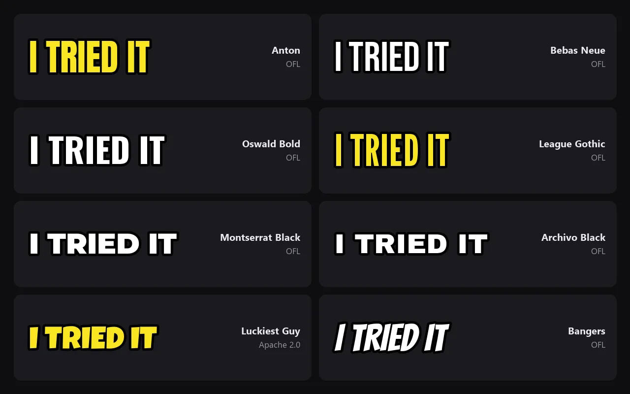
Condensed sans: Anton, Bebas Neue, Oswald, League Gothic
These are the workhorses. Because the letters are narrow, the words can be taller, and height is what makes text readable at small sizes. Anton and League Gothic are the most compact; Bebas Neue has a cleaner, more modern feel and very readable numbers; Oswald offers several weights, which helps when a series needs a title and a smaller episode label.
Geometric and neutral sans: Montserrat, Poppins, Roboto, Archivo Black
Wider fonts take more space but feel calm and trustworthy, a good fit for software tutorials, finance or education. Use the heaviest weight available, keep the phrase short and give it a solid background panel when the image is busy.
Display fonts: Luckiest Guy, Bangers, Lilita One, Permanent Marker
Display fonts bring personality, but they get tiring in long phrases. Use one for a single word or a short reaction, and pair it with a plain sans for anything longer. Permanent Marker works best for small handwritten notes and arrows rather than for the main headline.
What font do big YouTubers use?
There is no single official YouTube thumbnail font. Fans and designers often attribute MrBeast’s chunky lettering to Komika Axis, a comic-style display face. We have not seen an official confirmation, and its license is not the same as the Google Fonts licenses, so read the terms that come with any download before you use it on a monetized channel. Luckiest Guy and Bangers give a similar energy under an open license.
Impact, the classic meme font, ships with Windows and macOS but is not open-licensed. If you work with an editor on another computer or in an online design tool, Anton gives a similar tall, heavy look under the OFL. Look at the thumbnails in your own niche and you will usually see the same pattern: one heavy sans-serif, set large, in two colors at most.
Thumbnail text size, length and placement
- Three to five words. The title already explains the video. The thumbnail adds the hook, the result or the question.
- Big main word. As a rule of thumb, make the most important word at least a sixth of the image height, about 120 px on a 1280 × 720 thumbnail.
- Keep the bottom-right corner clear. YouTube places the video length there.
- Leave a margin. Keep text roughly 40 px away from the edges so nothing feels cramped or gets cut off.
- Design at full size. Work on a 1280 × 720 px (16:9) canvas. The YouTube Thumbnail Resizer crops an image to 16:9 and exports JPG or PNG at a compact file size.
Then check it at the real size. Zoom out until the thumbnail is about 200 px wide, or open it on your phone. If you cannot read the words in one second, remove a word or make the rest bigger.
Outline, shadow and the best colors for thumbnail text
Text on top of a photo or gameplay needs separation from the background. From subtle to strong, you have three options:
- Drop shadow: a soft black shadow slightly below the letters. Enough for simple, dark backgrounds.
- Outline (stroke): a dark outline of about 6–10% of the letter height. The most common thumbnail treatment for white or yellow text.
- Solid panel: a block of color behind the words. The most reliable choice on busy gameplay or crowded scenes.
The best color for a thumbnail word is the one with the most contrast against its background. White and yellow with a black outline read on most images; on light backgrounds, use black or a deep color. Highlight one key word, such as a number or a result, in an accent color instead of coloring every word. Avoid red text on green and other low-contrast pairs that are hard to separate for color-blind viewers.
Pairing fonts and keeping a consistent style
- Use two fonts at most: one display font for the hook and one sans for everything else.
- Keep the same font, color and position for a series, so returning viewers recognize it instantly.
- Save a template with your fonts, outline and margins, and change only the image and the words.
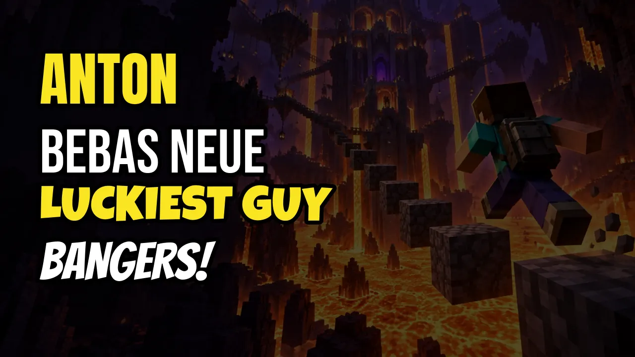
Gaming channels can start from a ready layout: the Minecraft Thumbnail Maker places an editable headline over a screenshot and exports a 1280 × 720 image. For a clean background still from your own footage, grab a sharp frame with the Video Frame Extractor. Running a channel without appearing on camera? See our faceless YouTube channel ideas for formats where the thumbnail does even more of the work.
Font licensing for monetized channels
A thumbnail on a monetized channel counts as commercial use. The OFL lets you use a font in commercial work, including images and videos; what you cannot do is sell the font files on their own. The Apache License 2.0 is similarly permissive.
Be careful with fonts labeled “free for personal use” on download sites. Monetized videos are usually commercial use, so those fonts need a paid license. Keep a note of where each font came from, together with its license file.
Frequently asked questions
What is the best font for YouTube thumbnails?
There is no single best font, but heavy condensed sans-serifs such as Anton, Bebas Neue and Oswald are the safest choice because they stay readable at small sizes. For a playful look, use Luckiest Guy or Bangers for one or two words and keep the rest in a plain sans.
What font does MrBeast use for thumbnails?
Fans and designers often attribute MrBeast’s lettering to Komika Axis, a comic-style display font, but there is no official confirmation. Check the license included with any download before using it commercially. Luckiest Guy and Bangers are open-licensed alternatives with a similar feel.
Can I use Google Fonts on a monetized YouTube channel?
Yes. Fonts in the Google Fonts library are published under open licenses such as the SIL Open Font License or the Apache License 2.0, which allow commercial use, including thumbnails and videos. You just cannot sell the font files themselves.
How big should text be on a YouTube thumbnail?
As a rule of thumb, make the main word at least a sixth of the image height, about 120 pixels on a 1280 × 720 thumbnail, and use no more than three to five words. Check the result at phone size before you upload.
What size should a YouTube thumbnail be?
Design at 1280 × 720 pixels in a 16:9 ratio, with a minimum width of 640 pixels, and export as JPG, PNG or GIF. A file under 2 MB is a safe target for every channel.
What color text works best on a thumbnail?
Contrast matters more than any particular color. White or yellow text with a black outline reads on most images, and black text works on light backgrounds. Highlight one key word in an accent color instead of coloring every word.
Tools mentioned in this guide
YouTube Thumbnail Resizer
Crop to 16:9 and export a 1280 × 720 thumbnail at a compact size.
Minecraft Thumbnail Maker
Put an editable headline on a gaming screenshot.
Video Frame Extractor
Save a sharp still from your video as the background.